Week 7: Spatial Autocorrelation

Slides for this week can be downloaded here.
Spatial Patterns & Relationships
So far we have produced maps of data and done some cursory comparisons of the different patterns revealed within the data. Now we can move to performing some quantitative analysis on the patterns to establish if they do show trends over space. This session therefore covers how to:
- Run a global spatial autocorrelation for the Borough of Camden
- Identify local indicators of spatial autocorrelation
- Run a Getis-Ord
There are quite a few new concepts this week, with some heavy stats thrown in. I have provided a lot of links to where you can find additional information. I find it helps to read around different articles that explain the same ideas and concepts, you may find one hard to follow whilst another makes perfect sense. So if you ‘get it’ don’t feel you need to read everything I link to, but if there’s an idea/ concept that you’re struggling with then cast your net widely for readings. This stuff is hard!
First we must set the working directory and load the data/ packages.
library(sf)
library(tmap) # remember this might be best done by ticking the packages box on the right.

OA.Census<-st_read(dsn = "worksheet_data/Census_OA_Shapefile.geojson")

# We also need to take the centre point - or centroid - of each Output Area to use in some of the plots below so do that now.

oa_centroid <- st_centroid(OA.Census)

plot(oa_centroid)
Remember the distribution of our qualification variable? We will be working on that today. We should first map it to remind us of its spatial pattern.
tm_shape(OA.Census) + tm_fill("Qualification", palette = "Reds", style = "quantile", title = "% with a Qualification") + tm_borders(alpha=.4)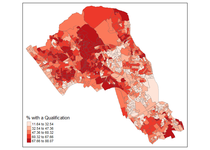
Running a spatial autocorrelation
A spatial autocorrelation measures how distance influences a particular variable across a dataset. In other words, it quantifies the degree of which objects are similar to nearby objects. Variables are said to have a positive spatial autocorrelation when similar values tend to be closer together than dissimilar values.

Waldo Tober’s first law of geography is that “Everything is related to everything else, but near things are more related than distant things.” so we would expect most geographic phenomena to exert a spatial autocorrelation of some kind. In population data this is often the case as persons of similar characteristics tend to reside in similar neighbourhoods driven by a range of factors such as house prices, proximity to work places and cultural preferences. Daniel Griffiths is one of the pioneers of developing was to understand and quantify spatial autocorrelation and he has a useful article you can read here.
We will be using the spatial autocorrelation functions available from the spdep package.
library(spdep)Finding neighbours
In order for the subsequent model to work, we need to work out what polygons neighbour each other. The following code will calculate neighbours for our OA.Census polygon and print out the results below.
# Calculate neighbours
neighbours <- poly2nb(OA.Census)
neighbours
## Neighbour list object:
## Number of regions: 751
## Number of nonzero links: 4360
## Percentage nonzero weights: 0.7730483
## Average number of links: 5.805593We can plot the links between neighbours to visualise their distribution across space.
plot(neighbours, st_geometry(oa_centroid), col='red')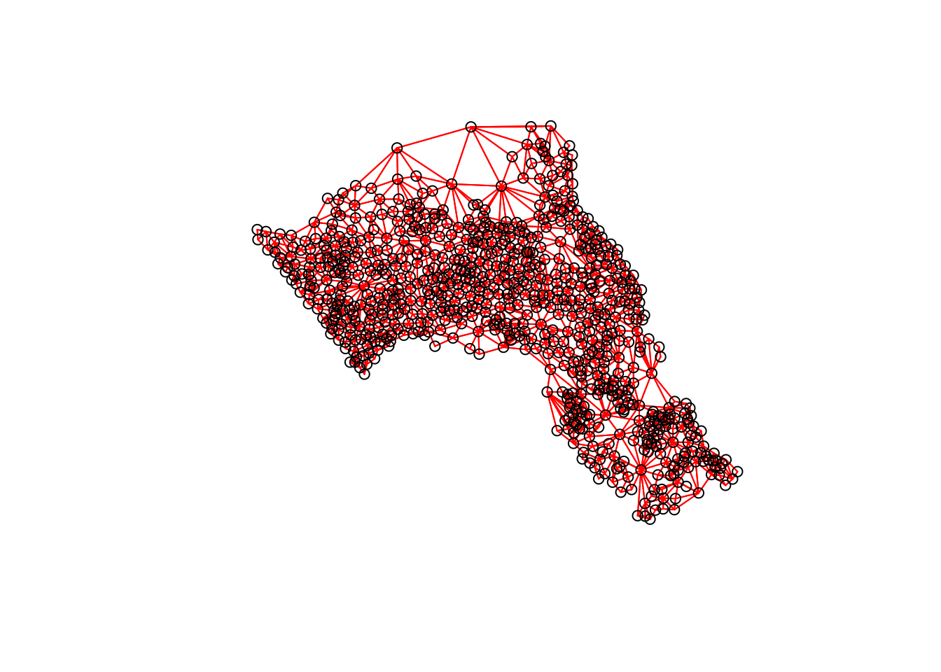
# Calculate the Rook's case neighbours
neighbours2 <- poly2nb(OA.Census, queen = FALSE)
neighbours2
## Neighbour list object:
## Number of regions: 751
## Number of nonzero links: 4248
## Percentage nonzero weights: 0.7531902
## Average number of links: 5.656458We can already see that this approach has identified fewer links between neighbours. By plotting both neighbour outputs we can interpret their differences.
# We can plot these neighbours alongside each other
par(mfrow=c(1,2))
plot(neighbours, st_geometry(oa_centroid), col='blue')
plot(neighbours2, st_geometry(oa_centroid), col='red')
We can represent spatial autocorrelation in two ways; globally or locally. Global models will create a single measure to represent the entire study area, whilst local models let us explore how spatial clustering varies across space.
Tests for Spatial Autocorrelation
With the neighbours defined. We can now run a model. First we need to convert the data types of the neighbours object. This file will be used to determine how the neighbours are weighted.
# Convert the neighbour data to a listw object
listw <- nb2listw(neighbours2, style="W")
listw## Characteristics of weights list object:
## Neighbour list object:
## Number of regions: 751
## Number of nonzero links: 4248
## Percentage nonzero weights: 0.7531902
## Average number of links: 5.656458
##
## Weights style: W
## Weights constants summary:
## n nn S0 S1 S2
## W 751 564001 751 281.3525 3119.364Moran’s I Background
(the information in this section has been taken from here and here.)
Before we go any further it is worth reading a bit more on the Moran’s I statistic:
It is arguably the most commonly used indicator of global spatial autocorrelation. It was initially suggested by Moran (1948), and popularized through the classic work on spatial autocorrelation by Cliff and Ord (1973). In essence, it is a cross-product statistic between a variable and its spatial lag, with the variable expressed in deviations from its mean.
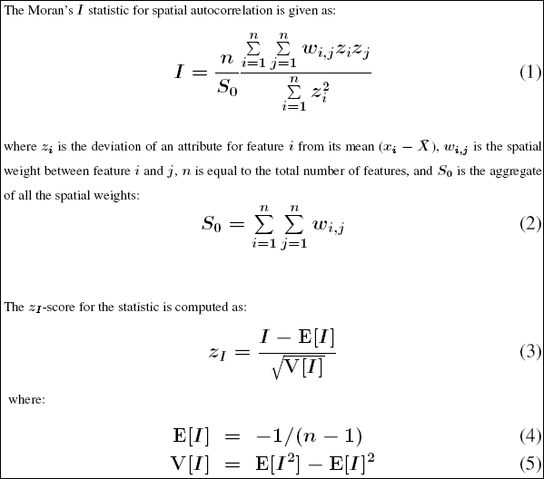
The tool computes the mean and variance for the attribute being evaluated. Then, for each feature value, it subtracts the mean, creating a deviation from the mean. Deviation values for all neighboring features (features within the specified distance band, for example) are multiplied together to create a cross-product. Notice that the numerator for the Global Moran’s I statistic includes these summed cross-products. Suppose features A and B are neighbors, and the mean for all feature values is 10. Notice the range of possible cross-product results:
When values for neighboring features are either both larger than the mean or both smaller than the mean, the cross-product will be positive. When one value is smaller than the mean and the other is larger than the mean, the cross-product will be negative. In all cases, the larger the deviation from the mean, the larger the cross-product result. If the values in the dataset tend to cluster spatially (high values cluster near other high values; low values cluster near other low values), the Moran’s Index will be positive. When high values repel other high values, and tend to be near low values, the Index will be negative. If positive cross-product values balance negative cross-product values, the Index will be near zero. The numerator is normalized by the variance so that Index values fall between -1.0 and +1.0.
Given the number of features in the dataset and the variance for the data values overall, the tool computes a z-score and p-value indicating whether this difference is statistically significant or not. Index values cannot be interpreted directly; they can only be interpreted within the context of the null hypothesis.
Inference for Moran’s I is based on a null hypothesis of spatial randomness. The distribution of the statistic under the null can be derived using either an assumption of normality (independent normal random variates), or so-called randomization (i.e., each value is equally likely to occur at any location).
An alternative to an analytical derivation is a computational approach based on permutation. This calculates a reference distribution for the statistic under the null hypothesis of spatial randomness by randomly permuting the observed values over the locations. The statistic is computed for each of these randomly reshuffled data sets, which yields a reference distribution.
This distribution is then used to calculate a so-called pseudo p-value. The pseudo p-value is only a summary of the results from the reference distribution and should not be interpreted as an analytical p-value. Most importantly, it should be kept in mind that the extent of significance is determined in part by the number of random permutations. More precisely, a result that has a p-value of 0.01 with 99 permutations is not necessarily more significant than a result with a p-value of 0.001 with 999 permutations. For information R does 99 permutations.
Moran Scatter Plot
The Moran scatter plot, first outlined in Anselin (1996), consists of a plot with the spatially lagged variable on the y-axis and the original variable on the x-axis.
When we refer to the ‘spatially lagged variable’ we referring to the relationship between the target spatial unit and its neighbours. The spatial lag is the product of the spatial weights matrix and a given variable and that if W is row-standardized the result amounts to the average value of the neighbours of the target spatial unit.
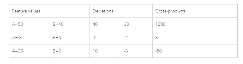
Below is an example of the plot. In the case of the dot that the red arrow is pointing at we can see it represents a target Output Area in Camden with a “Qualification” value of approximately 10 (the x-axis) and then a “Lag” value (the y-axis) of 49. This means that the average “Qualification” value of the target’s neighbours is 49.

To create the above plot, we execute the following:
# This function calculates the spatial lag values for the Qualification variable.
Lag <- lag.listw(nb2listw(neighbours2, style = "W"), OA.Census$Qualification)

# For ease we create a new object with the qualification values.
Qualification<- OA.Census$Qualification

# We can then plot one against the other.
plot(Qualification, Lag)

# This code adds the dotted lines where the average values are. Confusingly h is for the y axis, v for the x.
abline(h = mean(Qualification), lty = 2)
abline(v = mean(Lag), lty = 2)
An important aspect of the visualization in the Moran scatter plot is the classification of the nature of spatial autocorrelation into four categories. As a rule, the plot is centered on the mean (of zero), all points to the right of the mean have zi>0 and all points to the left have zi<0.
# Recentering the values
Qual.recenter<- Qualification-mean(Qualification)
Lag.recenter<- Lag-mean(Lag)

# Replotting the plot, note the change in values along the axes, and the center point is now zero.
plot(Qual.recenter, Lag.recenter)
abline(h = 0, lty = 2)
abline(v = 0, lty = 2)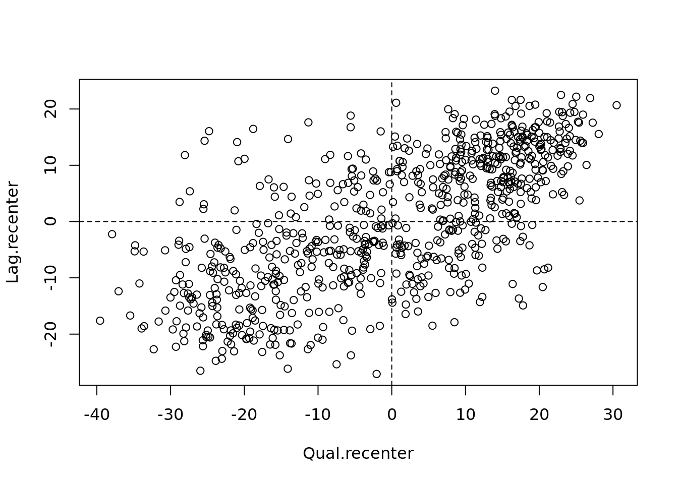
We refer to these values respectively as high and low, in the limited sense of higher or lower than average. Similarly, we can classify the values for the spatial lag above and below the mean as high and low.
The scatter plot is then decomposed into four quadrants:
- The upper-right quadrant and the lower-left quadrant correspond with positive spatial autocorrelation (similar values at neighboring locations). We refer to them as respectively high-high and low-low positive spatial autocorrelation.
- In contrast, the lower-right and upper-left quadrant correspond to negative spatial autocorrelation (dissimilar values at neighboring locations). We refer to them as respectively high-low and low-high negative spatial autocorrelation.
# To add the slope (you need the previous plot open):
xy.lm <- lm(Lag.recenter ~ Qual.recenter)
abline(xy.lm, lty=3)
The classification of the spatial autocorrelation into four types begins to make the connection between global and local spatial autocorrelation. However, it is important to keep in mind that the classification as such does not imply significance, particularly if lots of points cluster around the centre. This is further explored in our discussion of local indicators of spatial association (LISA).
We can now run the model. This type of model is known as a Moran’s test. This will create a correlation score between -1 and 1. Much like a correlation coefficient, 1 determines perfect positive spatial autocorrelation (so our data is clustered), 0 identifies the data is randomly distributed and -1 represents negative spatial autocorrelation (so dissimilar values are next to each other).
# global spatial autocorrelation
moran.test(OA.Census$Qualification, listw)
##
## Moran I test under randomisation
##
## data: OA.Census$Qualification
## weights: listw
##
## Moran I statistic standard deviate = 22.94, p-value < 2.2e-16
## alternative hypothesis: greater
## sample estimates:
## Moran I statistic Expectation Variance
## 0.509412997 -0.001333333 0.000495702The Moran’s I statistic is 0.51, we can therefore determine that there our qualification variable is positively autocorrelated in Camden. In other words, the data does spatially cluster. We can also consider the p-value to consider the statistical significance of the mode.
For more information (and where some of the above material is sourced from) click here. It is tutorial for a different software package but the there is lots of useful theoretical explanation.
Running a local spatial autocorrelation
First run the localmoran function…
# creates a local moran output
local <- localmoran(x = OA.Census$Qualification, listw = nb2listw(neighbours2, style = "W"))
By considering the help page for the localmoran function (run ?localmoran in R) we can observe the arguments and outputs. We get a number of useful statistics from the mode which are as defined:
| Name | Description |
|---|---|
| Ii | local moran statistic |
| E.Ii | expectation of local moran statistic |
| Var.Ii | variance of local moran statistic |
| Z.Ii | standard deviation of local moran statistic |
| Pr() | p-value of local moran statistic |
First we will map the local moran statistic (Ii). A positive value for Ii indicates that the unit is surrounded by units with similar values.
# binds results to our polygon shapefile
moran.map <- OA.Census

moran.map<- cbind(OA.Census, local)

# maps the results
tm_shape(moran.map) + tm_fill(col = "Ii", style = "quantile", title = "local moran statistic") 
From the map it is possible to see the variations in autocorrelation across space. We can interpret that there seems to be a geographic pattern to the autocorrelation. Why not try to make a map of the P-value to observe variances in significance across Camden? Use names(moran.map) to find the column headers.
It is not possible, however, to understand if these are clusters of high or low values. One thing we could try to do is to create a map which labels the features based on the types of relationships they share with their neighbours (i.e. high and high, low and low, insigificant, etc…). For this we refer back to the Moran’s I scatterplot created a few moments ago.

The code below first extracts the data that fall in each quadrant and assigns them either 1,2,3,4 depending on which they fall into, and those values deemed insignificant get assigned zero.
### to create LISA cluster map ###
quadrant <- vector(mode="numeric",length=nrow(local))

# significance threshold
signif <- 0.1

# builds a data quadrant
quadrant[Qual.recenter <0 & Lag.recenter<0] <- 1 #LOW-LOW BOTTOM LEFT
quadrant[Qual.recenter <0 & Lag.recenter>0] <- 2 #LOW-HIGH TOP LEFT
quadrant[Qual.recenter >0 & Lag.recenter<0] <- 3 #HIGH-LOW BOTTOM RIGHT
quadrant[Qual.recenter >0 & Lag.recenter>0] <- 4 #HIGH-HIGH TOP RIGHT

# We can get the significance values from the local object created in the Moran's I calculation. If they are lower than the threshold we set above then they are assigned 0.
quadrant[local[,5]>signif] <- 0
We can now build the plot based on these values – assigning each a colour and also a label.
# Plot. Note that the findInterval function assigns the colours we need to colour the map according whether they are 0,1,2,3,4.
brks <- c(0,1,2,3,4)
colors <- c("white","blue",rgb(0,0,1,alpha=0.4),rgb(1,0,0,alpha=0.4),"red")

# Note that I have snuck in a [1] after the OA.Census object, this is state that we only need plot the first column in the spatial object, if you don't do this you will get lots of identical maps.

plot(OA.Census[1],border="lightgray",col=colors[findInterval(quadrant,brks,all.inside=FALSE)], main="Camden Spatial Clustering: Qualification")
legend("bottomleft",legend=c("insignificant","low-low","low-high","high-low","high-high"),fill=colors,bty="n")
The resulting map reveals that it is apparent that there is a statistically significant geographic pattern to the clustering of our qualification variable in Camden.
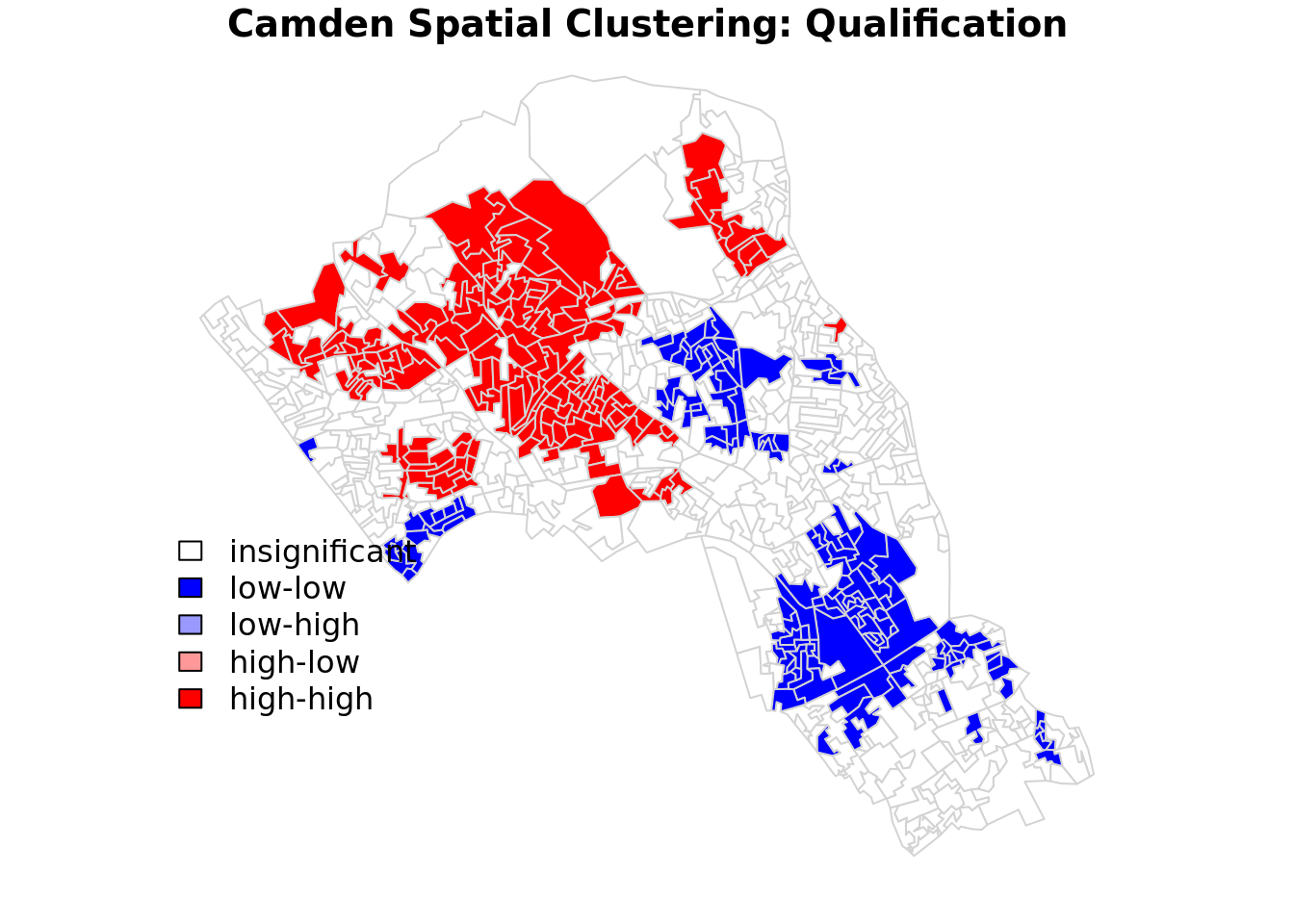
In this case we do not have any ‘low-high’ and ‘high-low’ values on the map, because these areas do not meet the significance criteria. If you make the significance threshold 1 then it will include all areas and you get the map below.

Be sure to put the significance back to 0.1!
A note on the range of values
We should expect the Local Moran’s I values to fall between -1 and + 1, in our case from the map we created it is clear that they fall slightly above and slightly below. This is not a disaster, but it does indicate that something may not be quite right in the way that we have defined our neighbour relationships.
The most common problem is that the weights have not been row-standardised. Row standardisation is used to create proportional weights in cases where features have an unequal number of neighbours. It involves dividing each neighbour weight for a feature by the sum of all neighbour weights for that feature and is recommended whenever the distribution of features is potentially biased due to sampling design or an imposed aggregation scheme. This is commonly the case in social datasets of the kind we are looking at here. In our code:
local <- localmoran(x = OA.Census$Qualification, listw = nb2listw(neighbours2, style = "W"))You will see the style="W" parameter. This instructs the nb2listw function to row standardise the weights, so that can’t be the cause of the larger range of values we see here. “B” is the basic binary coding, which means that the neighbours are simply encoded as 0 for non-neighbouring units and a 1 for those that are neighbours. This is the most straightforward but may not not be the best. As we have seen above row-standardisation is an important approach and specified with the “W” option if we find our values falling outside of -1 to 1.
The help file references a paper that sheds some more light on the impact of different weighting approaches to the analysis. It suggests “C” as another option, which is globally standardised (sums over all neighbour links). For the case of “C” it’s impact is to give more weight in our analysis to spatial objects with more neighbours, whereas “W” gives more weight to those with fewer connections. In effect this means that in the former case we are giving more weight to the LSOA’s in the centre of Camden, whilst in the latter case we give more weight to those around the edge. The paper proposes a third approach “S” that attempts to do something in between. Quite how we decide what is best is down to domain expertise and thinking about our data – are our areas on the edge of Camden more important than those in the centre? Do we have more reliable data there? Are more people living in them? Do they exhibit the characteristics we are interested in? These are not easy questions to answer definitively so it’s good to provide your rationale and then let the reader be the judge of it. You should try out the different approaches to see the impacts on your result.
So, back to our Moran’s I values outside the -1, 1 range. If we have taken the correct approach with the row standardisation, what else could it be? Most likely is either that our input variable is strongly skewed (you can perhaps create a histogram of the data values to see this), and/or some features have very few neighbors. Ideally you will want each feature to have at least eight neighbors, which is unlikely to be the case for Camden given the parameters we have used, and the fact that so many spatial units occur along the edge of the boundary.
Given that the adjacency (as in the Rook or Queen’s case) hasn’t been sufficient to reach the threshold of 8 we can look to a distance based approach. In the code below we say that any areas that are within 2.5km (2500m) of one another are considered neighbours.
#Create new neighbours, within 2000m
nb <- dnearneigh(st_centroid(OA.Census),0,2500)

#Perform Moran's I
local <- localmoran(x = OA.Census$Qualification, listw = nb2listw(nb, style = "W"))

#Join to spatial data
moran.map <- OA.Census
moran.map<- cbind(OA.Census, local)

#Create map
tm_shape(moran.map) + tm_fill(col = "Ii", style = "quantile", title = "local moran statistic")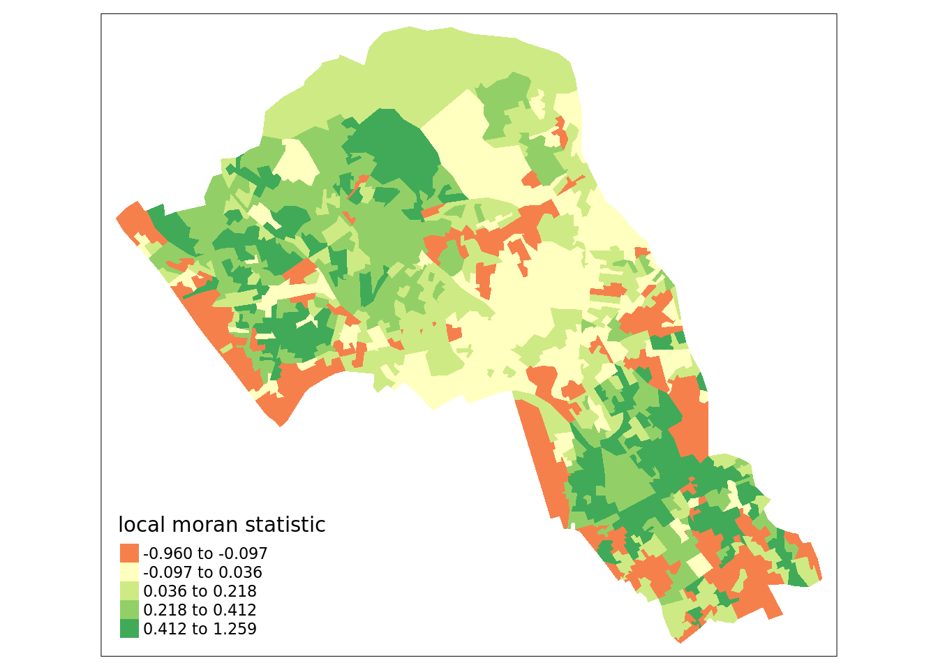
Now you can see the values are bounded between -1 and +1 (okay, it’s slightly above with a value of 1.259).
Try now with a 1km neighbour threshold and a 4km threshold. What impact does this have on the Moran’s I values? How might you judge what is the best approach?
These links provide some useful additional information:
This is a very nice run through of the above using different data. You don’t need to worry about the section on the Monte Carlo Approach to Significance, but there are some really clear illustrations of the respective calculation steps. https://mgimond.github.io/Spatial/spatial-autocorrelation.html
An intro to Moran’s I for non-spatial statisticians: http://www.isca.in/MATH_SCI/Archive/v3/i6/2.ISCA-RJMSS-2015-019.pdf
This paper is a little technical: https://onlinelibrary.wiley.com/doi/pdf/10.1111/j.1538-4632.1984.tb00797.x
A more detailed tutorial by Roger Bivand, who created the package we use: https://cran.r-project.org/web/packages/spdep/vignettes/CO69.html
Getis-Ord
Another approach we can take is hot-spot analysis. The Getis-Ord Gi Statistic looks at neighbours within a defined proximity to identify where either high or low values cluster spatially. Here statistically significant hot spots are recognised as areas of high values where other areas within a neighbourhood range also share high values too.
Conceptually this is slightly different from local Moran’s I. As Livings and Wu (2020) explain:
Local Moran’s I is used to describe the relationship between each individual observation and its neighbors, identifying both clusters (High-High, Low-Low) and spatial outliers (High-Low, Low-High), whereas Getis-Ord Gi* is used exclusively for cluster identification, highlighting clusters of high values (hot spots) and clusters of low values (cold spots). Computation of Getis-Ord Gi* yields both a Gi* statistic for each observation and corresponding statistical significance (i.e., 90%, 95% or 99% confidence). In contrast, computation of local Moran’s I identifies clusters and spatial outliers only at the α = 0.05 significance level.
Getis-Ord Gi* incorporates the spatial weights matrix with all neighboring values (xj) of any observation i within a specified distance (d) including itself (i.e. j=i) in the numerator. The denominator is the sum of all neighboring values (xj), again including observations for which j=i.

So first we can tweak our new set of neighbours, based on proximity. The code sets the limit to 800 metres, but worth tweaking this to see its effects.
# creates centroid and joins neighbours within 0 and x units
nb <- dnearneigh(st_centroid(OA.Census),0,800)
# creates listw
nb_lw <- nb2listw(nb, style = 'B')

# plot neighbours
plot(nb, st_geometry(oa_centroid), col='red')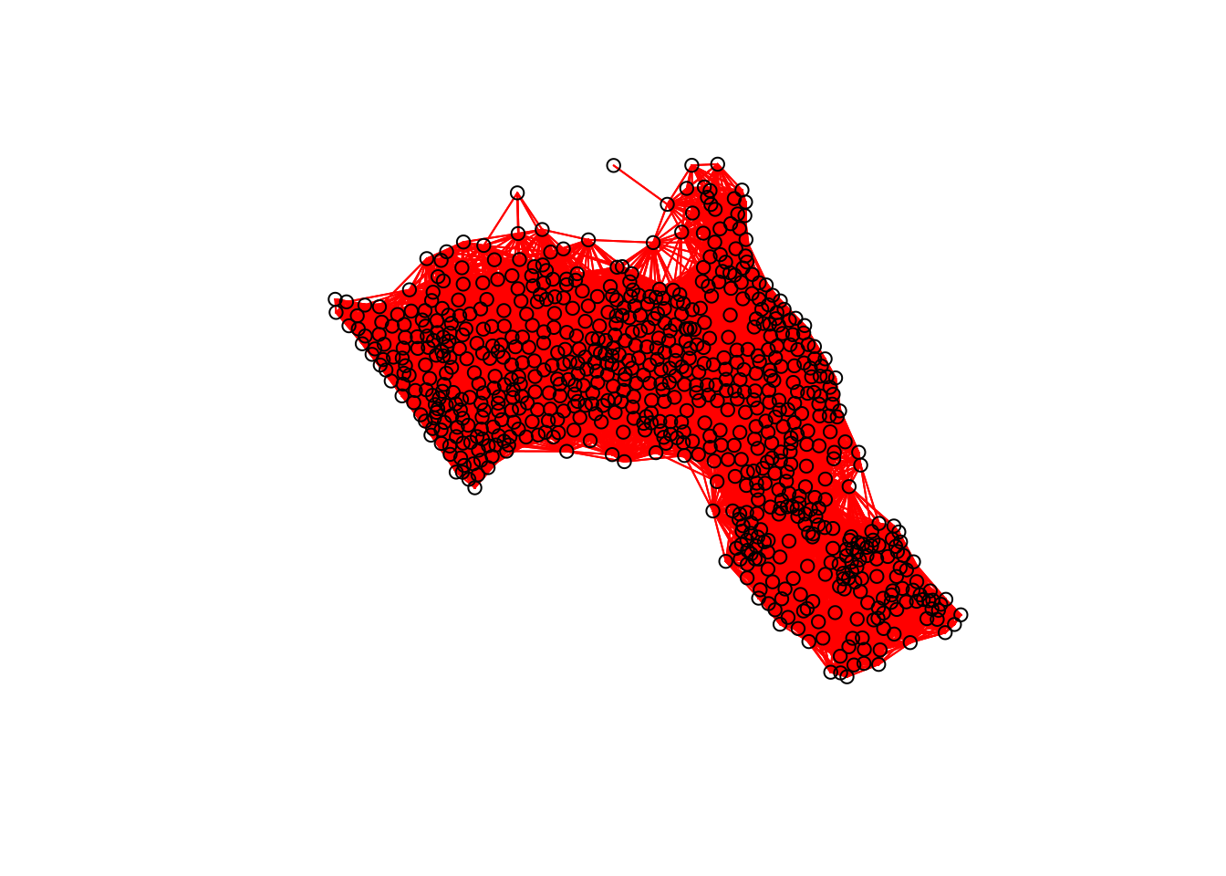
With a set of neighbourhoods established we can now run the test.
# compute Getis-Ord Gi statistic
local_g <- localG(OA.Census$Qualification, nb_lw)

local_g_sp<- cbind(OA.Census, as.matrix(local_g))
names(local_g_sp)[14] <- "gstat"

# map the results
tm_shape(local_g_sp) + tm_fill("gstat", palette = "RdBu", style = "pretty") + tm_borders(alpha=.4)
The Gi Statistic is represented as a Z-score. Greater values represent a greater intensity of clustering and the direction (positive or negative) indicates clusters of high or low values.
Additional Task
Repeat the analysis you have undertaken in this worksheet for the London Borough of Southwark.
Hint: Think back to how you prepared the data for Camden last week, and repeat those steps extracting Southwark.
Reading
This article from the GIS Body of Knowledge is essential reading and a nice complement to the materials above. This from ESRI is a good run through of the fundamentals of modeling spatial relationships.
Advances in spatial epidemiology and geographic information systems: A useful paper that outlines how some of the methods we have covered can be used in the context of epidemiology.
The ecological fallacy revisited: aggregate verses individual-level findings on economies and elections, and sociotropic voting: Written in the 80s, but still relevant to this module since it’s a nice demonstration of how the ecological fallacy can imply different voting behaviours.
Spatial autocorrelation and data uncertainty in the American Community Survey: a critique: The American Community Survey is an important source of data in the US (it acts a bit like our census in the UK). This paper combines some of the issues we have discussed surrounding sources of uncertainty and how they might play out when measuring spatial autocorrelation.
Reflections on spatial autocorrelation: Written by Art Getis who, with Cliff Ord, created the Getis-Ord statistic this editorial reflects on spatial autocorrelation for a special issue of the Regional Science Journal. The rest of the special issue is a little off focus for us, so no need to go beyond this article.
Uncertainty in the effects of the modifiable area unit problem under different levels of spatial autocorrelation: a simulation study: Quite a technical paper that looks at the MAUP and how it relates to spatial autocorrelation. It uses simulated rather than real world data so is a little abstract but a nice run through if you want to learn more.
People of the British Isles: a preliminary analysis of genotypes and surnames in a UK-control population: A paper I had a small role in that has a nice example of the use of the location quotient being used to analyse concentrations of names.