Week 7: Southwark Map Solution
This is a run through of the previous Spatial Autocorrelation section but using data from the London Borough of Southwark, not Camden. It is therefore a useful revision exercise and a nice reminder that with only a few tweaks to your code you can re-run your analysis for an entirely different area/ dataset.
Loading data into R
library(sf)
library(tmap)

# We don’t need to go back to the beginning of the data preparation task. If you look through that code you will recall we saved a file called “eng_wales_practical_data.csv”, which contained our selection of census variables across England and Wales. So the first step, therefore is to locate that file and load it in.

census_data<- read.csv("worksheet_data/eng_wales_practical_data.csv")

# Now we load the spatial data file that has all of the Output Areas for England and Wales in. This might take a moment.

Output.Areas <- st_read("worksheet_data/OA_2021_EW_BGC_V2.shp")
We can then copy the trick we used for Camden and locate the column that looks like it has names in it and search using the ‘grepl’ function for ‘Southwark’
OA.Southwark<- Output.Areas[grepl('Southwark', Output.Areas$LSOA21NM),]

plot(OA.Southwark)
If you look at the OA.Southwark you will see 751 obs and that LSOA21NM column is full of “Southwarks”. Check the plot to confirm you have the Borough of Southwark
Now we add the ethnicity, unemployment, qualification variables etc to the spatial object. This requires another merge.
OA.Census<- merge(OA.Southwark, census_data, by.x="OA21CD", by.y="OA")You can now see those columns in the OA.Census file, and they can be mapped.
# this will produce a quick map of our qualification variable
qtm(OA.Census, fill = "Qualification")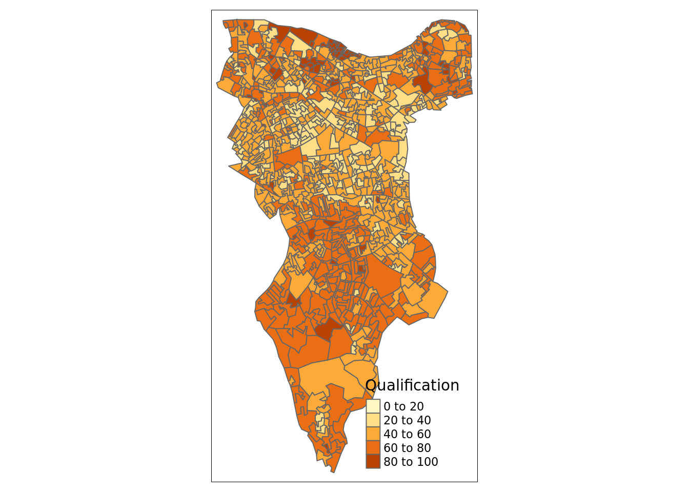
Now is a good time to save the OA.Census file so you don’t need to repeat the above steps. I’ll leave this to you to type in the code.
Now we can replicate the spatial autocorrelation analysis, almost exactly as the code appears in the practical.
Running a spatial autocorrelation
Remember, we use the spatial autocorrelation functions available from the spdep package.
library(spdep)

# We also need to extract the centroids to create some of the plots below
oa_centroid <- st_centroid(OA.Census)
Finding neighbours
In order for the subsequent model to work, we need to work out what polygons neighbour each other. The following code will calculate neighbours for our OA.Census polygon and print out the results below.
# Calculate neighbours
neighbours <- poly2nb(OA.Census)
neighbours
## Neighbour list object:
## Number of regions: 959
## Number of nonzero links: 5532
## Percentage nonzero weights: 0.6015129
## Average number of links: 5.768509We can plot the links between neighbours to visualise their distribution across space.
plot(neighbours, st_geometry(oa_centroid), col='red')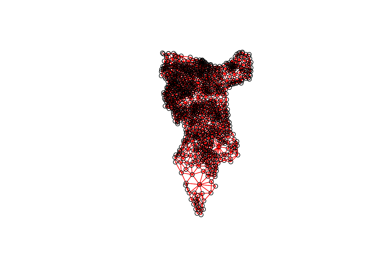
# Calculate the Rook's case neighbours
neighbours2 <- poly2nb(OA.Census, queen = FALSE)
neighbours2
## Neighbour list object:
## Number of regions: 959
## Number of nonzero links: 5416
## Percentage nonzero weights: 0.5888998
## Average number of links: 5.64755We can already see that this approach has identified fewer links between neighbours. By plotting both neighbour outputs we can interpret their differences.
# We can plot these neighbours alongside each other
par(mfrow=c(1,2))
plot(neighbours, st_geometry(oa_centroid), col='blue')
plot(neighbours2, st_geometry(oa_centroid), col='red')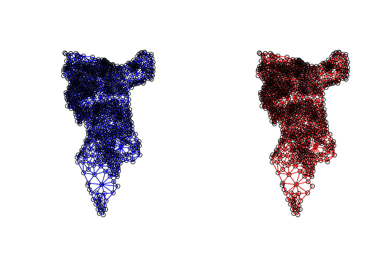
We can represent spatial autocorrelation in two ways; globally or locally. Global models will create a single measure which represent the entire data whilst local models let us explore spatial clustering across space.
Running a global spatial autocorrelation
With the neighbours defined. We can now run a model. First we need to convert the data types of the neighbours object. This file will be used to determine how the neighbours are weighted
# Convert the neighbour data to a listw object
listw <- nb2listw(neighbours2, style="W")
listw## Characteristics of weights list object:
## Neighbour list object:
## Number of regions: 959
## Number of nonzero links: 5416
## Percentage nonzero weights: 0.5888998
## Average number of links: 5.64755
##
## Weights style: W
## Weights constants summary:
## n nn S0 S1 S2
## W 959 919681 959 362.848 4004.373We can now run the model. This type of model is known as a moran’s test. This will create a correlation score between -1 and 1. Much like a correlation coefficient, 1 determines perfect postive spatial autocorrelation (so our data is clustered), 0 identifies the data is randomly distributed and -1 represents negative spatial autocorrelation (so dissimilar values are next to each other).
# global spatial autocorrelation
moran.test(OA.Census$Qualification, listw)
#>
#>     Moran I test under randomisation
#>
#> data:  OA.Census$Qualification
#> weights: listw
#>
#> Moran I statistic standard deviate = 28, p-value <2e-16
#> alternative hypothesis: greater
#> sample estimates:
#> Moran I statistic       Expectation          Variance
#>          0.587052         -0.001121          0.000428
The moran I statistic is 0.59, we can therefore determine that there our qualification variable is positively autocorrelated in Southwark. In other words, the data does spatially cluster. We can also consider the p-value to consider the statistical significance of the model.
Running a local spatial autocorrelation
We will first create a moran plot which looks at each of the values plotted against their spatially lagged values. In the Camden example we do this step by step, but actually R has a handy function that can create a similar plot in one line.
# This function calculates the spatial lag values for the Qualification variable.
Lag <- lag.listw(nb2listw(neighbours2, style = "W"), OA.Census$Qualification)

# For ease we create a new object with the qualification values.
Qualification<- OA.Census$Qualification

# We can then plot one against the other.
plot(Qualification, Lag)

# This code adds the dotted lines where the average values are. Confusingly h is for the y axis, v for the x.
abline(h = mean(Qualification), lty = 2)
abline(v = mean(Lag), lty = 2)
Is it possible to determine a positive relationship from observing the scatter plot? Recentering and adding a slope line may help.
# Recentering the values
Qual.recenter<- Qualification-mean(Qualification)
Lag.recenter<- Lag-mean(Lag)

# Replotting the plot, note the change in values along the axes, and the center point is now zero.
plot(Qual.recenter, Lag.recenter)
abline(h = 0, lty = 2)
abline(v = 0, lty = 2)

# To add the slope (you need the previous plot open):
plot(Qual.recenter, Lag.recenter)
xy.lm <- lm(Lag.recenter ~ Qual.recenter)
abline(xy.lm, lty=3)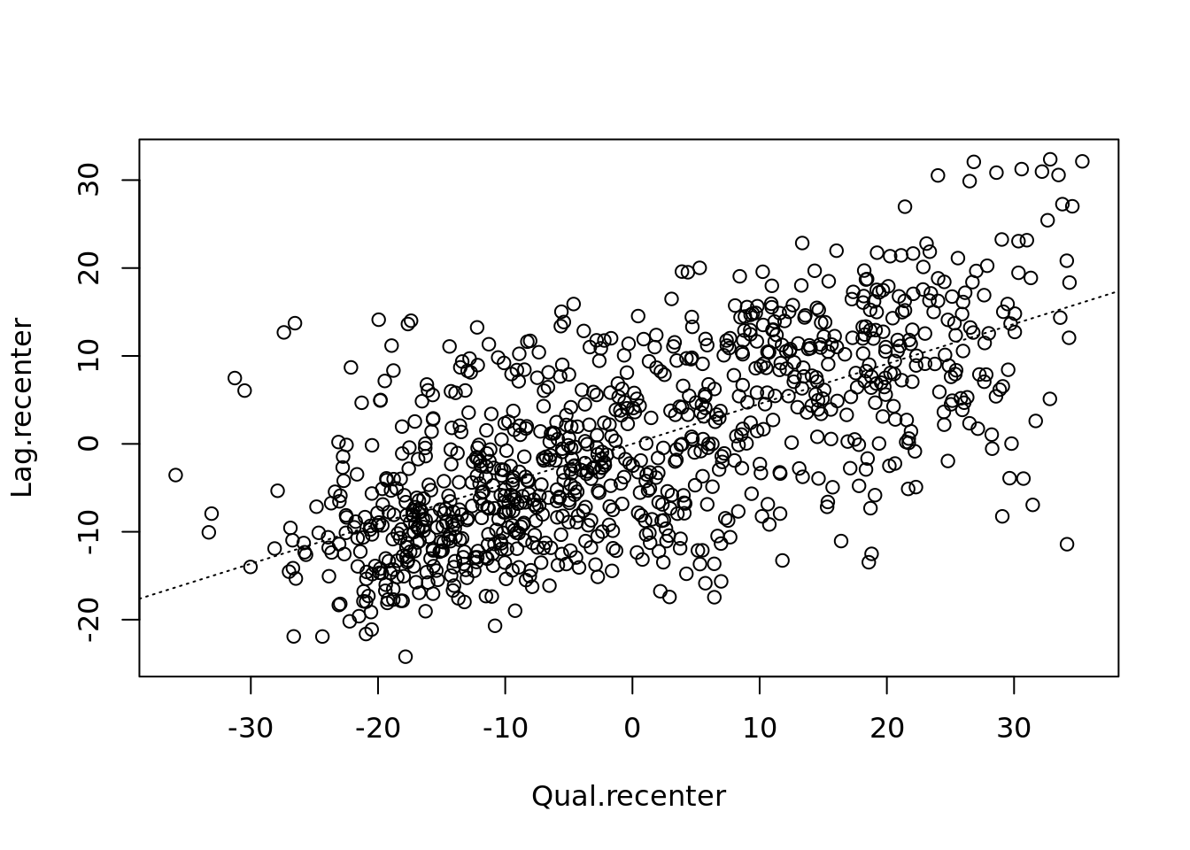
# creates a local moran output
local <- localmoran(x = OA.Census$Qualification, listw = nb2listw(neighbours2, style = "W"))
By considering the help page for the localmoran function (run ?localmoran in R) we can observe the arguments and outputs. We get a number of useful statistics from the mode which are as defined:
| Name | Description |
|---|---|
| Ii | local moran statistic |
| E.Ii | expectation of local moran statistic |
| Var.Ii | variance of local moran statistic |
| Z.Ii | standard deviation of local moran statistic |
| Pr() | p-value of local moran statistic |
First we will map the local moran statistic (Ii). A positive value for Ii indicates that the unit is surrounded by units with similar values.
# binds results to our polygon shapefile
moran.map <- OA.Census

moran.map<- cbind(OA.Census, local)

# maps the results
tm_shape(moran.map) + tm_fill(col = "Ii", style = "quantile", title = "local moran statistic") 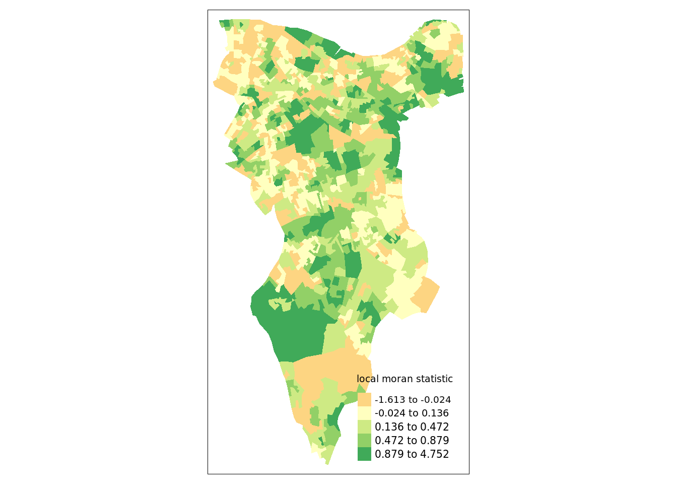
From the map it is possible to see the variations in autocorrelation across space. We can interpret that there seems to be a geographic pattern to the autocorrelation. However, it is not possible to understand if these are clusters of high or low values.
Why not try to make a map of the P-value to observe variances in significance across Southwark? Use names(moran.map) to find the column headers.
One thing we could try to do is to create a map which labels the features based on the types of relationships they share with their neighbours (i.e. high and high, low and low, insignificant, etc…).
The code below first extracts the data that fall in each quadrant and assigns them either 1,2,3,4 depending on which they fall into, and those values deemed insignificant get assigned zero. In the Camden example we extract the points directly from the spatially lagged object we created. Here we do something slightly different by looking at the local Moran’s I value.
### to create LISA cluster map ###
quadrant <- vector(mode="numeric",length=nrow(local))

# significance threshold
signif <- 0.1

# builds a data quadrant
quadrant[Qual.recenter <0 & Lag.recenter<0] <- 1 #LOW-LOW BOTTOM LEFT
quadrant[Qual.recenter <0 & Lag.recenter>0] <- 2 #LOW-HIGH TOP LEFT
quadrant[Qual.recenter >0 & Lag.recenter<0] <- 3 #HIGH-LOW BOTTOM RIGHT
quadrant[Qual.recenter >0 & Lag.recenter>0] <- 4 #HIGH-HIGH TOP RIGHT

# We can get the significance values from the local object created in the Moran's I calculation. If they are lower than the threshold we set above then they are assigned 0.
quadrant[local[,5]>signif] <- 0
We can now build the plot based on these values – assigning each a colour and also a label.
# Plot. Note that the findInterval function assigns the colours we need to colour the map according whether they are 0,1,2,3,4.
brks <- c(0,1,2,3,4)
colors <- c("white","blue",rgb(0,0,1,alpha=0.4),rgb(1,0,0,alpha=0.4),"red")

# Note that I have snuck in a [1] after the OA.Census object, this is state that we only need plot the first column in the spatial object, if you don't do this you will get lots of identical maps.

plot(OA.Census[1],border="lightgray",col=colors[findInterval(quadrant,brks,all.inside=FALSE)], main="Camden Spatial Clustering: Qualification")
legend("bottomleft",legend=c("insignificant","low-low","low-high","high-low","high-high"),fill=colors,bty="n")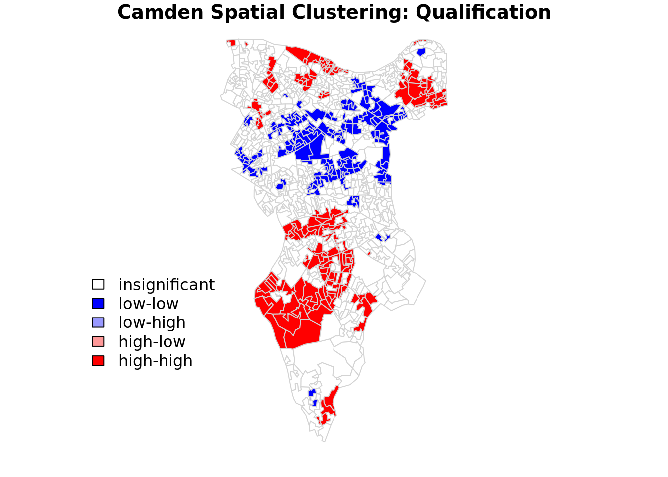
The resulting map reveals that it is apparent that there is a statistically significant geographic pattern to the clustering of our qualification variable in Southwark. But there is a mistake…go back to the code a correct it!
Getis-Ord
Another approach we can take is hot-spot analysis. The Getis-Ord Gi Statistic looks at neighbours within a defined proximity to identify where either high or low values cluster spatially. Here statistically significant hot spots are recognised as areas of high values where other areas within a neighbourhood range also share high values too.
First we need to define a new set of neighbours. Whilst the spatial autocorrection considered units which shared borders, for Getis-Ord we are defining neighbours based on proximity. We will use a search 800 meters for our model in Southwark. This can be adjusted.
# creates centroid and joins neighbours within 0 and x units
nb <- dnearneigh(st_centroid(OA.Census),0,800)
# creates listw
nb_lw <- nb2listw(nb, style = 'B')
# plot neighbours
plot(nb, st_geometry(oa_centroid), col='red')With a set of neighbourhoods estabilished we can now run the test.
# compute Getis-Ord Gi statistic
local_g <- localG(OA.Census$Qualification, nb_lw)

local_g_sp<- OA.Census

local_g_sp<- cbind(OA.Census, as.matrix(local_g))
names(local_g_sp)[14] <- "gstat"

# map the results
tm_shape(local_g_sp) + tm_fill("gstat", palette = "RdBu", style = "pretty") + tm_borders(alpha=.4)
The Gi Statistic is represented as a Z-score. Greater values represent a greater intensity of clustering and the direction (positive or negative) indicates high or low clusters.