Week 10: Advanced R
Open RStudio and then File-> New File – > R Markdown. You may be asked to install additional packages – agree to this. You will see the scripting window populated with some text – this is what R Markdown looks like. It is a way of including texts and images alongside your analysis.
All the materials on this website were created with R Markdown, it means the code can be executed and then the outputs of the analysis etc such as the plots are automatically embedded in the document. If you want to tweak your data or analysis you can simply re-run it and the document updates. It is very useful for tutorials as the code needs to execute correctly for the worksheet to generate so we know there are no errors in the code.
Now press the small down arrow next to the *knit* button at the top of the R Markdown window and click *knit to pdf*. Name the file you are about to create – this will be saved in your directory. You will then see all the code chunks executed in the console – if you have any errors in your code it will stop executing and you will need to fix them and then click *knit to pdf* again. Once it has finished there may be a pop-up window error. If this happens select “Try Again”. If that doesn’t work you should be able to click on the file in the files list on the right.
You should have a PDF that contains the below:
## R Markdown

This is an R Markdown document. Markdown is a simple formatting syntax for authoring HTML, PDF, and MS Word documents. For more details on using R Markdown see <http://rmarkdown.rstudio.com>.

When you click the **Knit** button a document will be generated that includes both content as well as the output of any embedded R code chunks within the document. You can embed an R code chunk like this:


```r
summary(cars)

##      speed           dist
##  Min.   : 4.0   Min.   :  2.00
##  1st Qu.:12.0   1st Qu.: 26.00
##  Median :15.0   Median : 36.00
##  Mean   :15.4   Mean   : 42.98
##  3rd Qu.:19.0   3rd Qu.: 56.00
##  Max.   :25.0   Max.   :120.00
Including Plots
You can also embed plots, for example:

These are the building blocks of an R Markdown document. Note that the echo = FALSE parameter was added to the code chunk for the above plot to prevent printing of the R code that generated the plot. With echo=T the code will appear as well.
plot(pressure)
If you look in the grey area where the R code is written you will see a grey cog – click on this and you can adjust the outputs you would like to see in the final document. There is also a button that runs all code chunks above and then the green triangle runs only that code chunk. You will notice that any plots/ outputs now appear in the R Markdown window and in the console below.
Click here to download the markdown file used to create the above.
Upload this to your working directory in RStudio and then click on it to open. You can see how the code is laid out, try to replicate it rather than just copy and paste!
First, we must set the working directory and load the practical data.
# Remember to set the working directory as usual

# load the spatial libraries
library(sf)
library("tmap")

#load the spatial data
Census.Data<-st_read(dsn = "worksheet_data/Census_OA_Shapefile.geojson")
One of the core advantages of R and other command line packages over traditional software is the ability to automate several commands. You can tell R to repeat your methodological steps with additional variables without the need to retype the entire code again.
There are two ways of automating code. One means is by implementing user-written functions, another is by running for loops.
User-written functions
User-written functions allow you to create a function which runs a series of commands, it can include and input and output variable. You must also name the function yourself. Once the function has been run, it is saved in your work environment by R and you can run data through it by calling it as you would do with any other function in R (I.e. myfunction(data)).
The general structure is provided below:
# to create a new function
myfunction <- function(object1, object2, ... ){
statements
return(newobject)
}

# to run the function
Output <- myfunction(data)
When you create a function you do not need the name of the variables you use. You simply create a temporary object name (say ‘x’ for example), then when you run a data object through your function, it will take the place of x.
So for the purposes of an example, we will work on rounding our data first.
To round a variable we can simply use the round() function. It only requires us to input a data object and to specify how many decimal places we want our data rounded to.
So for one variable it would be:
# rounds data to one decimal place
round(Census.Data$Qualification, 1)
This is very straightforward. We will now put this in a new function called “myfunction”.
# function is called "myfunction", accepts one object (to be called x)
myfunction <- function(x){

# x is rounded to one decimal place, creates object z
z <- round(x,1)

# object z is returned
return(z)

# close function
}
Now run the function, it should appear in your environment panel. To run it we simply run data through it like so:
# lets create a new data frame so we don't overwrite our original data object
newdata <- Census.Data

# runs the function, returns the output to new Qualification_2 variable in newdata
newdata$Qualificaton_2 <- myfunction(Census.Data$Qualification)
This example is very simple. However, we can add further functions into our function to make it undertake more tasks. In the demonstration below, we also run logarithmic transformation prior to rounding the data.
# creates new function which logs and then rounds data
myfunction <- function(x){

z <- log(x)
y <- round(z,4)

return(y)

}

# resets the newdata object so we can run it again
newdata <- Census.Data

# runs the function
newdata$Qualification_2 <- myfunction(Census.Data$Qualification)
newdata$Unemployed_2 <- myfunction(Census.Data$Unemployed)
So here we create the z variable first, then run it through a second function to produce a y variable. However, as the code is run in order, we could give both z and y the same name to overwrite them as we run the function. I.e…
myfunction <- function(x){

z <- log(x)
z <- round(z,4)

return(z)

}
Now we will try something more advanced. We will enter our mapping code using tmap into a function so we are able to create maps more easily in the future. Here we have called the function ‘magic_map’. The code has three arguments this time (of course we could include more if we wanted to add more customisations) they are described in the table below.
| Object label | Argument |
|---|---|
| x | A polygon shapefile |
| y | A variable in the shapefile |
| z | A colour palette |
So the code is as follows…
# magic_map function with 3 arguments
magic_map <- function(x,y,z){

tm_shape(x) + tm_fill(y, palette = z, style = "quantile") + tm_borders(alpha=.4) +
tm_compass(size = 1.8, fontsize = 0.5) +
tm_layout(title = "Camden", legend.title.size = 1.1, frame = FALSE)

}
Now to run the magic_map function, we can very simply call the function and enter the three input parameters (x,y,z). Running our function is an easier way to create consistent maps in the future as it requires only one small line of code to call it.
We can now use the function to create a map for any spatial polygon data frame which contains numerical data. All we have to do is call the function and enter the three arguments. There are two examples below.
# runs map function, remember we need to include all 3 arguments of the function
magic_map(Census.Data, "Unemployed", "Blues")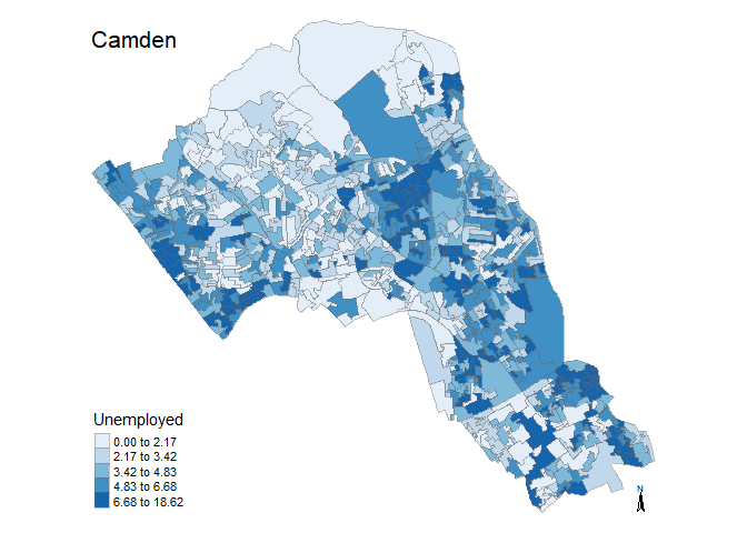
magic_map(Census.Data, "Qualification", "Reds")
Loops
A loop is a means to repeat code under defined conditions. This is a great way for reducing the amount of code you may need to write. For example, you could use the loop to iterate a series of commands through a number of different positions (i.e. rows) in a data frame.
The most basic means of looping commands in R is known as the ‘for loop’. To implement it, you run the for() function and within the parameters, you define the sequence through which the loop will input data. Usually, an argument is assigned (i) and given a range of numerical positions (i.e. in 2:5 which runs from position 2 to position 5). You next enter the commands which the loop will run within curly brackets following the parameters. The defined argument (i) is used to determine the input data for each iteration. This has been demonstrated in the example below which loops the code for four columns of our data frame.
Note in this example we are running the loop from column 10 to column 13 as these have our census variables.
# a for loop where i iterates from 10 to 13
for(i in 10:13){
 # i is used to identify the column number
plot(Census.Data[i])
 }

# Blink and you'll miss it but each variable was plotted. Rather than have them flash past we can save them as PDFs.

for(i in 10:13){
 # i is used to identify the column number
pdf(paste0("census_map_column_",i,".pdf"))
plot(Census.Data[i])
dev.off()
 }

#check out your working directory to see the PDFs of the maps!
If/ else statements
There are various commands we can run within for loops to edit their functionality. If-else statements allow us to change the outcome of the loop depending on a particular statement. For instance, if a value is below a certain threshold, you can tell the loop to round it up, otherwise (else) do nothing.
This time we are going to run the loop for every row in one variable to recode them to “low” and “high” labels. In this example, we are asking if the value in our data is below 50. If it is then we are giving it a “low” label. The else argument determines what R will do if the value does not meet the criterion, in this case it is given a “high” label.
# creates a new newdata object so we have it saved somewhere
newdata1 <- newdata

for(i in 1:nrow(newdata)){

if (newdata$White_British[i] < 50) {
   newdata$White_British[i] <- "Low";

} else {
   newdata$White_British[i] <- "High";

}
}
We can also input multiple else statements.
# copies the numbers back to newdata so we can start again
newdata <- newdata1


for(j in 2: ncol (newdata)){

for(i in 1:nrow(newdata)){

if (newdata[i,j] < 25) {
   newdata[i,j] <- "Very Low";

} else if (newdata[i,j] < 50){
   newdata[i,j] <- "Low";

} else if (newdata[i,j] < 75){
   newdata[i,j] <- "High";

} else {
   newdata[i,j] <- "Very High";

}
}
}
We can join the newdata data frame to our output area shapefile to map it using our earlier generated magic_map function.
# runs our predefined map function
magic_map(shapefile, "Qualification", "Set2")
Now press the small down arrow next to the knit button at the top of the R Markdown window and click knit to pdf. Name the file you are about to create – this will be saved in your directory. You will then see all the code chunks executed in the console – if you have any errors in your code it will stop executing and you will need to fix them and then click knit to pdf again. Once it has finished there may be a pop-up window error. If this happens select “Try Again”. If that doesn’t work you should be able to click on the file in the files list on the right.
R Markdown offers a huge range of options – see them all here and try some different commands out.
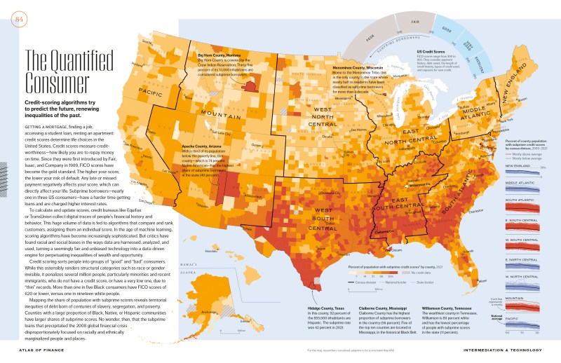
A Spatial Autocorrelation Analysis of COVID-19 Rates
Here is the code that demonstrates how we might take data on COVID-19 and perform spatial autocorrelation analysis on it. It also details how to create a function that provides a range of colour options from the data. It offers a good revision exercise for a number of elements of the module. This sets out the analysis of COVID-19 at the start of the second lockdown in England as of the 31st October 2020.
Download the data you need from here.
#load packages
library(sf)
library(tmap)
library(spdep)
For this analysis we will use COVID-19 rate data supplied by Public Health England (PHE) and edited by James Cheshire (UCL). The case rate data come from here and the boundary data here.
# load in file
input<- st_read(dsn="worksheet_data/COVID_Oct30_Rate.GeoJSON")
plot(input[1])

#only include areas where we have data (ie England)
input<-input[input$Rate_num!=0,]
plot(input[1])

# We also need to take the centre point - or centroid - of each Output Area to use in some of the plots below so do that now.
oa_centroid <- st_centroid(input)
First we will map the data to establish any visual patterns.
tm_shape(input) +
  tm_fill("Rate_num", palette = "Reds", legend.hist = T, breaks=c(0,25,50,100,150,200,736.2), title="COVID-19 CasesnPer 100k (Weekly)") +
  tm_borders(col="black", lwd=0.1)
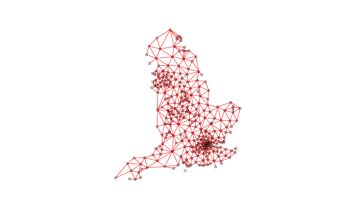
Next we can perform Moran’s I to determine what, if any, spatial autocorrelation may exist. Here we specify neighbours with a default distance threshold using the Queen’s case.
#Create neighbours
neighbours <- poly2nb(input)

plot(neighbours, st_geometry(oa_centroid), col='red')

local <- localmoran(x = input$Rate_num, listw = nb2listw(neighbours, zero.policy=T))
Now we perform Moran’s I using the above neighbours.
local <- localmoran(x = input$Rate_num, listw = nb2listw(neighbours, zero.policy=T))The following is a map of the local Moran’s I values:
moran.map <- input

moran.map<- cbind(input, local)

# maps the results
tm_shape(moran.map) + tm_fill(col = "Ii", style = "quantile", title = "local moran statistic") 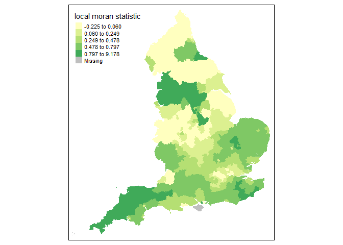
From the above map it clear that the North West and South West exhibit high Moran’s I values, suggesting some spatial autocorrelation in the COVID-19 rates.
We can now establish the nature of the autocorrelation using a LISA map.
### to create LISA cluster map ###
quadrant <- vector(mode="numeric",length=nrow(local))

# centers the variable of interest around its mean
m.Rate_num <- input$Rate_num - mean(input$Rate_num)

# Calculates lag

Lag <- lag.listw(nb2listw(neighbours, style = "W", zero.policy=T), input$Rate_num)

# centers the lag
m.Lag <- Lag - mean(Lag, na.rm=T)

# significance threshold
signif <- 0.1


# builds a data quadrant
quadrant[m.Rate_num <0 & m.Lag<0] <- 1
quadrant[m.Rate_num <0 & m.Lag>0] <- 2
quadrant[m.Rate_num >0 & m.Lag<0] <- 3
quadrant[m.Rate_num >0 & m.Lag >0] <- 4
quadrant[local[,5]>signif] <- 0


# plot in r
brks <- c(0,1,2,3,4)

colors <- c("white","blue",rgb(0,0,1,alpha=0.4),rgb(1,0,0,alpha=0.4),"red")
plot(input[1],border="lightgray",col=colors[findInterval(quadrant,brks,all.inside=FALSE)])
legend("bottomleft",legend=c("insignificant","low-low","low-high","high-low","high-high"),
       fill=colors,bty="n")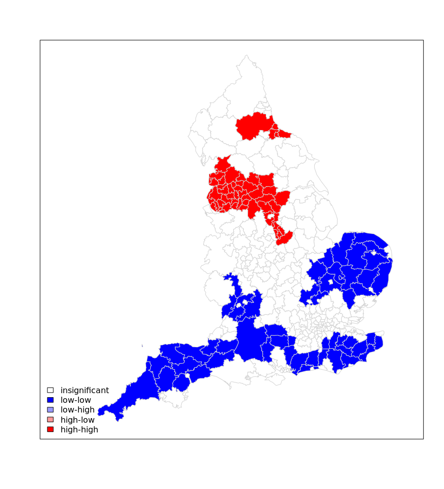
As the above shows there is a clear need for tougher measures to the North West of England in contrast to the potential for relaxed measures in the South West/ Eastern England.
Map Colour Function
Now we can create a function for different colour options for the rate data. This example is based on the example set out here where four different maps of the same data are used to show the importance of colour choices. They were to accompany this article
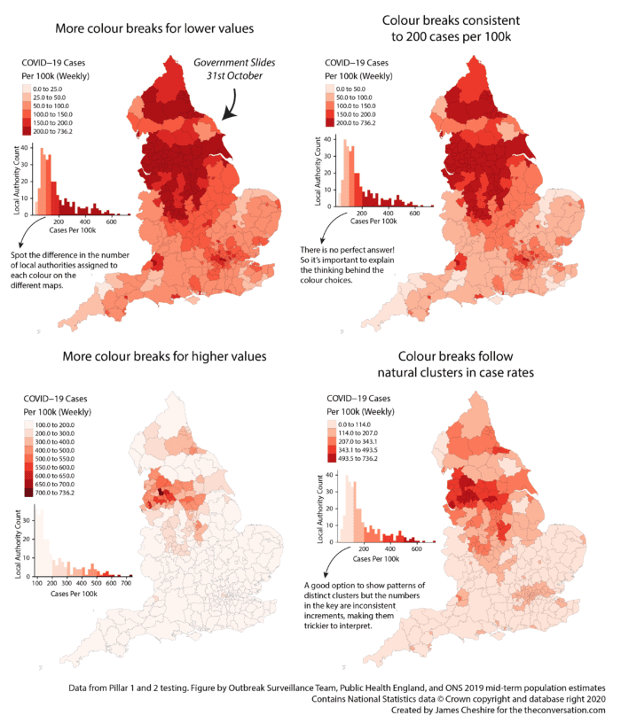
In this case I have chosen to specify 7 different parameters within the function. These are:
- spatialdata – this is the input spatial file we need for the map.
- variable – this is the attribute we will be using to determine the colour of the map.
- mappal – the colour palette selected. In this case I have specified
mappal="Reds"which means that “Reds” are the default option. You do not need to specify this when you execute the code, but you may wish to change it. - filename – the name of the PDF we are creating to export the maps.
- columns – the layout for the maps. We are creating 4 maps so columns=2 means its a 2×2 grid. columns=4 would mean 4 maps in a row.
- w – the width in inches of the PDF.
- h– the height in inches of the PDF. w and h are both good settings to tweak to make the maps look their best.
To learn more about each of the styles of colour breaks we are using see here (this is a preview of some of the content we cover in my third year Cartography and Data Visualisation module).
Look carefully at how I have adapted the code from the original to make it work for the function. Further adaptions can be made for sure, for example the title will not change if the data changes, but it’s a useful starting point.
mapcolours<- function(spatialdata, variable,mappal="Reds",filename,columns,w,h)
{

  #Suggestion 1
  opt1<-tm_shape(spatialdata) +
    tm_fill(variable, palette = mappal, legend.hist = T, style="jenks",title="COVID-19 CasesnPer 100k (Weekly)nJenks Breaks") +
    tm_borders(col="black", lwd=0.1)

  #Suggestion 2
  opt2<-tm_shape(spatialdata) +
    tm_fill(variable, palette = mappal, legend.hist = T, style="quantile",title="COVID-19 CasesnPer 100k (Weekly)nQuantile Breaks") +
    tm_borders(col="black", lwd=0.1)

  #Suggestion 3
  opt3<-tm_shape(spatialdata) +
    tm_fill(variable, palette = mappal, legend.hist = T, style="equal",title="COVID-19 CasesnPer 100k (Weekly)nEqual Breaks") +
    tm_borders(col="black", lwd=0.1)

  #Suggestion 4
  opt4<-tm_shape(spatialdata) +
    tm_fill(variable, palette = mappal, legend.hist = T, style="pretty",title="COVID-19 CasesnPer 100k (Weekly)nPretty Breaks") +
    tm_borders(col="black", lwd=0.1)

  #Save as PDF. NOTE that I have put the tmap_arrange within print(). This forces it to execute within the function as plots get ignored otherwise.
  pdf(filename,width=w, height=h)
  print(tmap_arrange(opt1,opt2,opt3,opt4,ncol=columns))
  dev.off()

}
Now we can run the function with the options – it might appear that nothing happens because the plots are saved as a PDF in your working directory, so look there to see if it worked!
mapcolours(input, "Rate_num",mappal = "Reds" ,filename = "COVID_Map.pdf", columns=2, w=10,h=20)## png
## 2From Class
Moran’s I etc.
From the deep archive…here is a video lecture I did during COVID, which might be useful as the audio will be better than lecturecast.
GWR
This is one for GWR…
The GWR discussion papers are:
- A Route Map for Successful Applications of Geographically Weighted Regression
- The Right to Rule by Thumb: A Comment on Epistemology in “A Route Map for Successful Applications of Geographically-Weighted Regression”
- Navigating the Methodological Landscape in Spatial Analysis: A Comment on “A Route Map for Successful Applications of Geographically-Weighted Regression”
- A Comment on “A Route Map for Successful Applications of Geographically-Weighted Regression”: The Alternative Expressway to Defensible Regression-Based Local Modeling
The Airbnb paper can be found here.
The Levelling up paper is here.