Skip to content
James Cheshire
About
Blog
Teaching
Papers
Category:
Slideshow
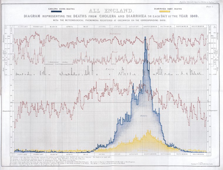
How the Victorians Mapped London’s Cholera
Mar 2, 2019
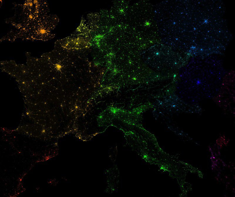
10 Million Dots: Mapping European Population
Mar 23, 2017
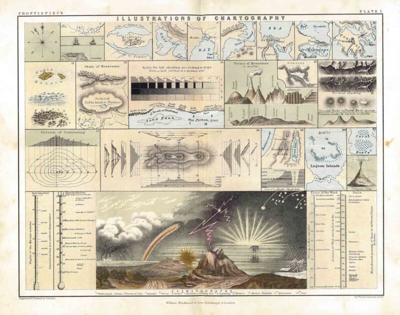
Illustrations of Chartography
Jan 23, 2017
London: The Information Capital
Sep 30, 2014
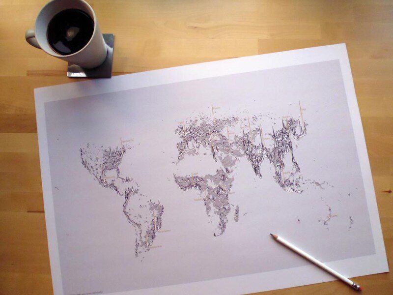
Population Lines Print
Aug 18, 2014
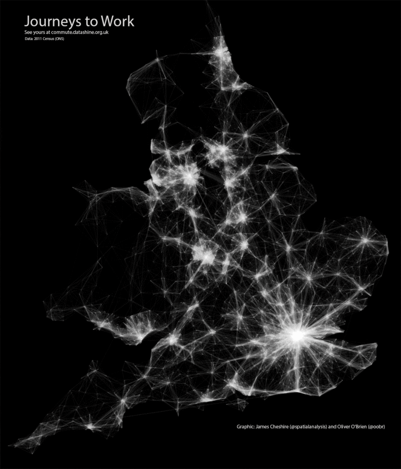
Mapped: Journeys to Work
Jul 25, 2014
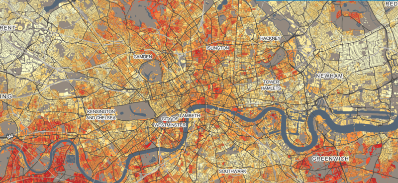
Welcome to DataShine!
Jun 17, 2014
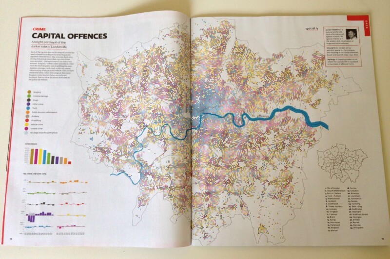
Crime Map of London
Jul 27, 2013
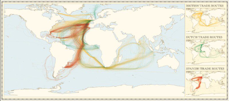
Updated: Colonial Shipping Routes
Jun 26, 2013
Mapped: London's Fire Engine Callouts
Jun 3, 2013
1
2
Next Page