Skip to content
James Cheshire
About
Blog
Teaching
Papers
Author:
James Cheshire
Automated Cartography: The urban expansion of Lansing
Feb 28, 2011
mappinglondon.co.uk: Another Blog about Maps!
Feb 25, 2011
ESRI (UK) Case Study
Feb 22, 2011
Mapping London's Population Change 1801-2030
Feb 16, 2011
Using R to Map with Google Chart Tools
Feb 12, 2011
Brilliant Boris Bikes Animation
Feb 2, 2011
Carto-Junk?
Jan 31, 2011
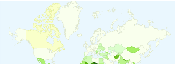
2010 Muslim Populations By Country
Jan 28, 2011
My Week in Maps
Jan 28, 2011
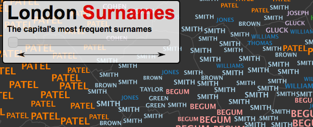
Mapping London's Surnames
Jan 24, 2011
Previous Page
1
…
10
11
12
13
Next Page