“Treemaps display hierarchical (tree-structured) data as a set of nested rectangles. Each branch of the tree is given a rectangle, which is then tiled with smaller rectangles representing sub-branches. A leaf node’s rectangle has an area proportional to a specified dimension on the data. Often the leaf nodes are colored to show a separate dimension of the data.
When the color and size dimensions are correlated in some way with the tree structure, one can often easily see patterns that would be difficult to spot in other ways, for example, if a certain color is particularly relevant. A second advantage of treemaps is that, by construction, they make efficient use of space. As a result, they can legibly display thousands of items on the screen simultaneously.” (source: Wikipedia)
I think treemaps are becoming an increasingly popular method of visualising multidimensional datasets and there are many ways to create them. This tutorial is going to focus on the use of R and builds on the one published on flowingdata.
Open R and install the following packages
 install.packages("portfolio")

install.packages("RColorBrewer")
now load them.
library(RColorBrewer)

library(portfolio)
The next step is to load in the data file we are using. This is an edited version of the London Borough Profiles csv taken from the London Datastore. There are five columns of data. The three we are interested in are “pop”, “earnings” and “party”.
input<-read.csv("https://jcheshire.com/wp-content/uploads/2011/08/tree_eg_data.csv")

attach(input)
A treemap generally requires 4 pieces of information:
the item- in this case the London Borough’s or “id”- each will be assigned a rectangle,
a value to scale the size of the rectangle by- in this case the population or “pop”,
a value for assigning the colour- in this case the average earnings per person or “earnings”,
and a broader group to which the item belongs- in this case the ruling political party or “party”.
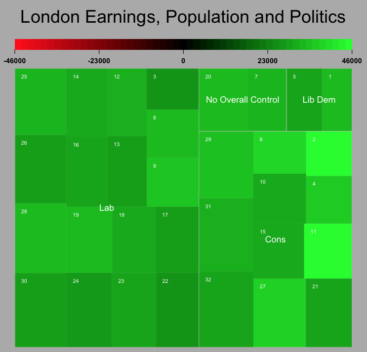
Armed with this we can simply used the map.market function from the portfolio package (installed earlier) to produce a treemap.
map.market(id, pop, party, earnings, lab = c(TRUE, TRUE), main="London Earnings, Population and Politics")

The output looks OK but I don’t really like the colours. I have therefore edited the code so that a selection of colours can be used using the ColorBrewer palettes. You can either download the code or load it straight away with
source("http://dl.dropbox.com/u/10640416/treemapbrewer.r")
you have now loaded in a new function called “treemap” that does a very similar job to the one above but has a few other options that you can see used below
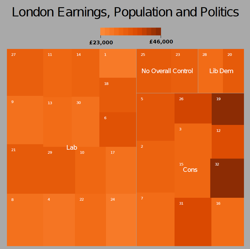
treemap(id, pop, party, earnings, lab = c(TRUE, TRUE), main="London Earnings, Population and Politics", pal="Oranges", linecol= "dark gray", textcol="white")

The plot above used the “Oranges” palette but there are many more such as “Blues”, “BuPu” and “Reds”. Try for example
treemap(id, pop, party, earnings, lab = c(TRUE, TRUE), main="London Earnings, Population and Politics", pal="Blues", linecol= "white", textcol="black")
When you are happy with the results save the plot as a pdf
pdf("my_tree_map2.pdf")

treemap(id, pop, party, earnings, lab = c(TRUE, TRUE), main="London Earnings, Population and Politics", pal="Oranges", linecol= "dark gray")

dev.off()
or PNG
png("my_tree_map2.png")

treemap(id, pop, party, earnings, lab = c(TRUE, TRUE), main="London Earnings, Population and Politics", pal="Oranges", linecol= "dark gray")

dev.off()
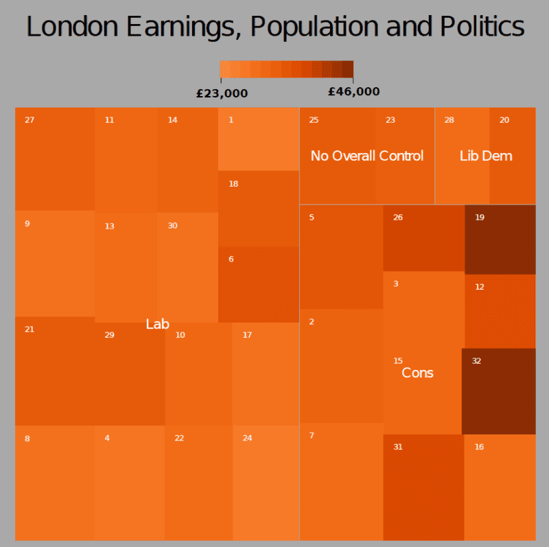
and then you can edit it using image/ vector editing software such as GIMP or Inkscape to get the following result:

I hope that the options to change colours makes for a more interesting treemaps than the standard red/green ones we are used to seeing. If anyone knows how to alter the scale bar so that it does not show values beyond the range of the data it would be great to see how it is done!
Improved Tree Maps with R
