James Cheshire
About
Blog
Teaching
Papers
Category:
London
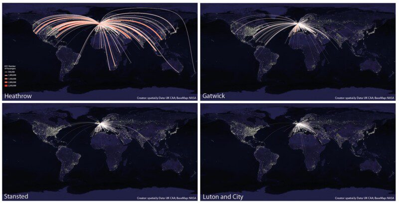
What's so Great About a World Flight Paths Map?
May 30, 2013
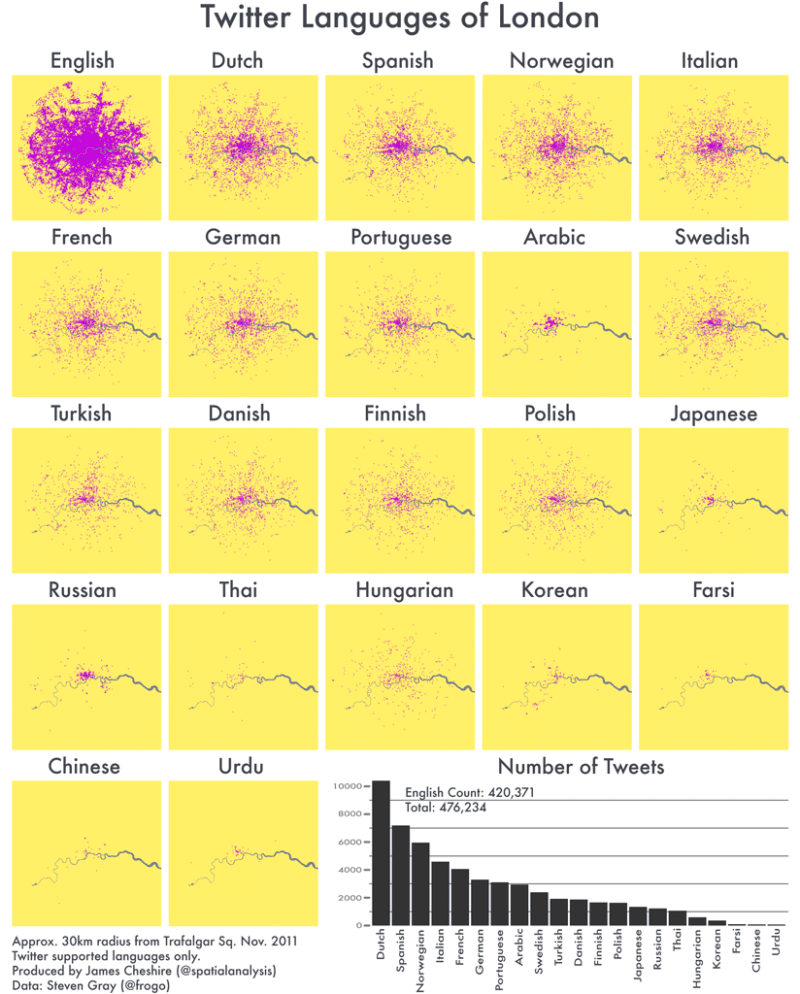
Mapped: Twitter Languages in London
Oct 22, 2012
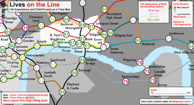
Lives on the Line: Life Expectancy and Child Poverty as a Tube Map
Jul 19, 2012
In Praise of Paper Maps
Jun 28, 2012
Sensing the City: Mapping London's Population Flows
Apr 26, 2012
The Twitter Languages of London
Apr 13, 2012
London Cycle Hire and Pollution
Feb 2, 2012
Just how far can the Tube take you?
Nov 22, 2011
OpenStreetMap: 5 Years of Mapping London
Nov 12, 2011
The Times Atlas of London
Oct 17, 2011
Previous Page
1
2
3
Next Page