James Cheshire
About
Blog
Teaching
Papers
Category:
Featured Maps
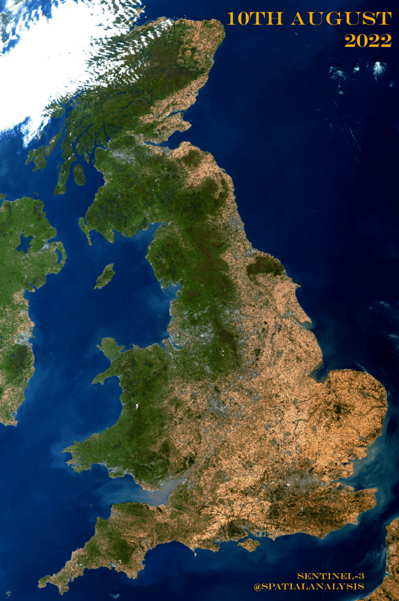
The Scarred Landscape of the Climate Crisis
Aug 10, 2022
Antarctica Ice Flows
Dec 18, 2021
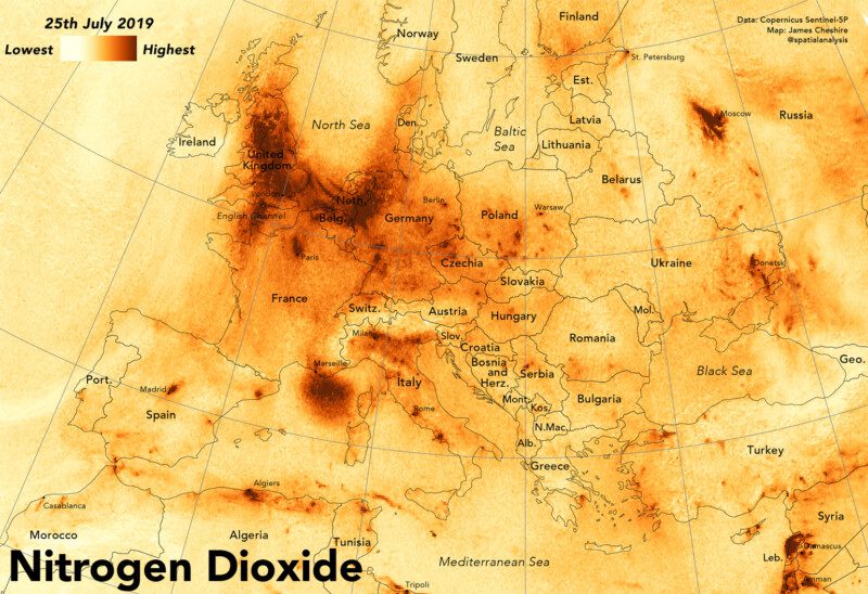
Mapping Nitrogen Dioxide Across Europe
Aug 24, 2020
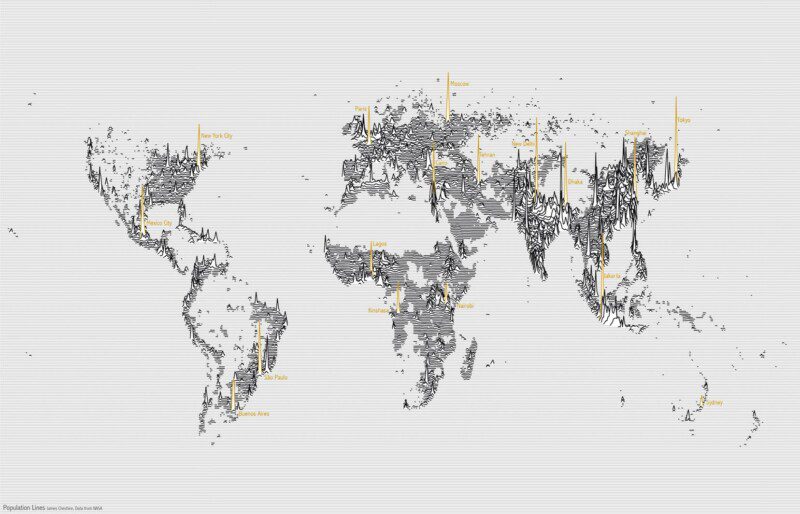
Population Lines: How and Why I Created It
Apr 27, 2017
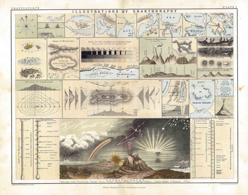
Illustrations of Chartography
Jan 23, 2017
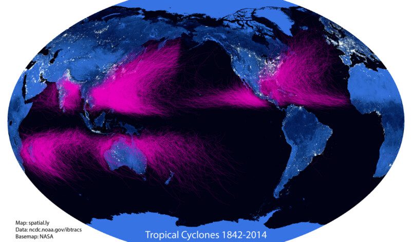
#15MinuteMap: Tropical Cyclone Tracks 1842-2014
Jul 15, 2015
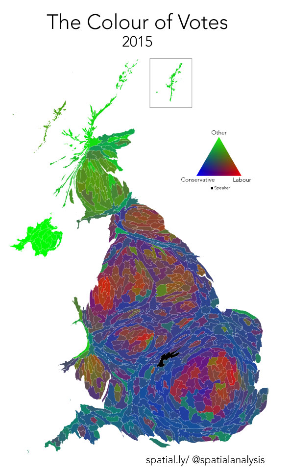
Colour of Votes: 2015 General Election
May 9, 2015
London: The Information Capital
Sep 30, 2014
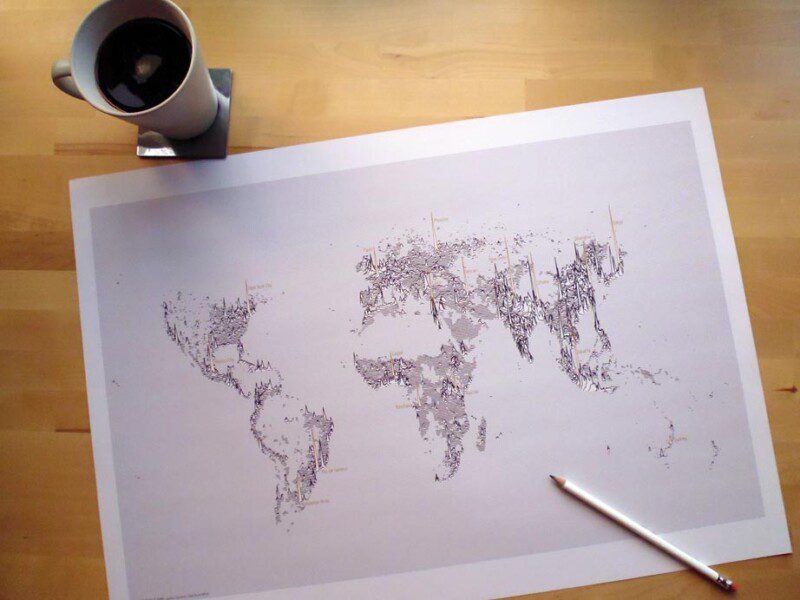
Population Lines Print
Aug 18, 2014
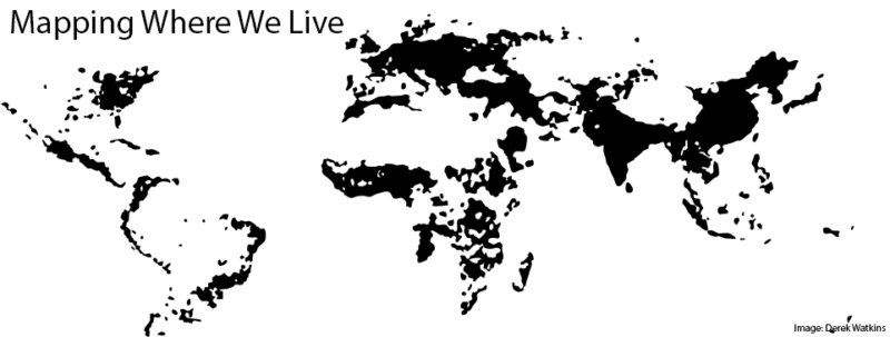
Mapping Where We Live
Oct 21, 2013
1
2
3
4
Next Page