James Cheshire
About
Blog
Teaching
Papers
Tag:
London
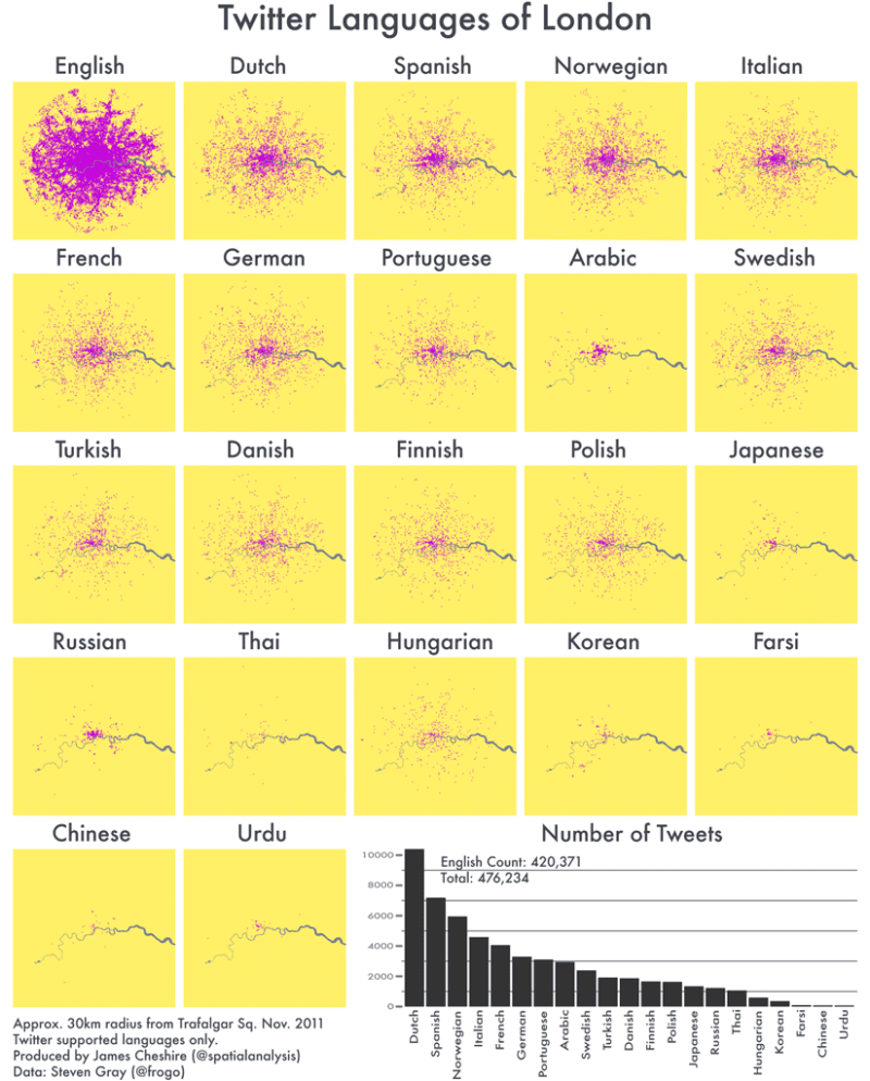
The Twitter Languages of London
Apr 13, 2012
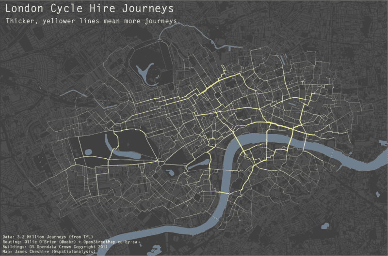
London Cycle Hire and Pollution
Feb 2, 2012
Great Maps with ggplot2
Feb 2, 2012
The Power of Comparison: Just How Big Is It?
Jan 16, 2012
OpenStreetMap: 5 Years of Mapping London
Nov 12, 2011
Mapping London's Population Change 1801-2030
Feb 16, 2011
Previous Page
1
2